Refining a spiritual identity for a modern community.
Atlanta SRF Logo Evolution
Project Overview
Client: Atlanta Center of Self-Realization Fellowship (SRF)
Role: Creative Direction · Logo Design · Visual Identity
Timeline & Scope: Logo reconstruction · Visual refinement · Identity exploration · Typography · Digital application guidance
The Challenge
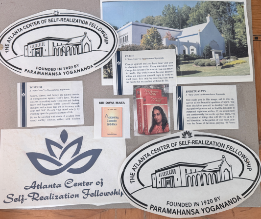
The existing logo had strong familiarity within the SRF Atlanta community, but its low-resolution source created limitations across digital applications. The goal was not to replace the identity, but to carefully evolve it:
- Preserve recognition
- Refine the existing form
- Create a mark that scales across digital and print
- Establish more consistent logo usage
The objective was not to reinvent the identity, but to preserve what the community already recognized while creating a cleaner, more intentional, and flexible visual system.
The Atlanta Center of Self-Realization Fellowship needed a refined digital identity that could preserve recognition and familiarity while improving the clarity and versatility of its existing logo.
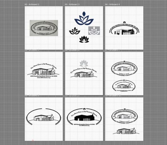
I reconstructed the original mark from a low-resolution source and developed an updated variation that introduces a more intentional lotus form—reflecting the upward path of Self-Realization while creating a cleaner, calmer visual expression for digital and mobile environments.

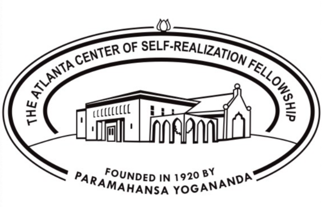
Original Logo
The Atlanta Center of Self-Realization Fellowship logo embodies a sense of peace, unity, and spiritual grounding. Encircled within a graceful oval, the design features a line-art illustration of the Atlanta temple while blending traditional and modern architectural elements to reflect both heritage and growth.
Above the structure rests a lotus symbol, representing awakening, inner stillness, and the unfolding of higher consciousness. The flowing script typography arches across the top, reinforcing a sense of harmony and continuity.
Logo Usage & Evolution
A spiritual emblem and a welcoming marker
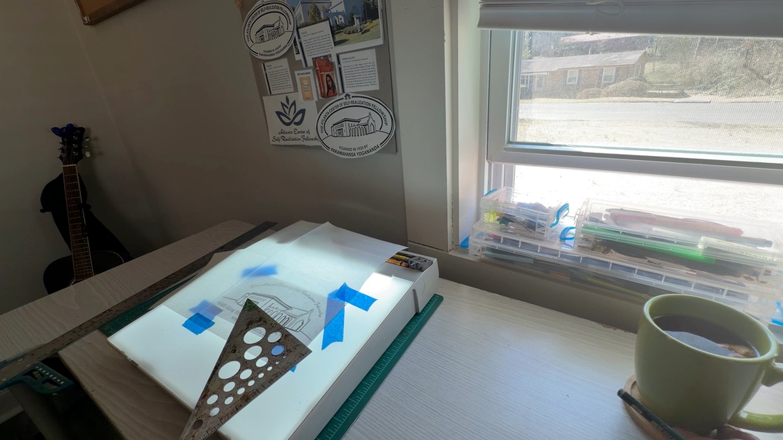
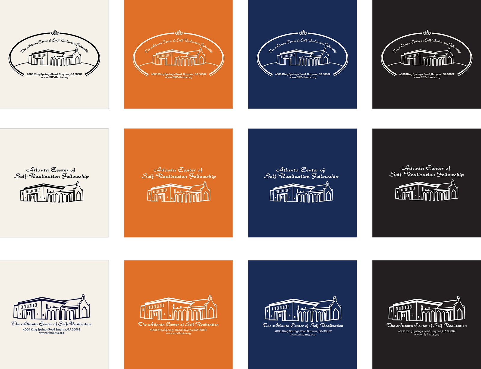
Signaling a place for meditation, reflection, and community connection, we carefully cleaned up and reconstructed the Atlanta Logo from its previous low-resolution format, as well as an updated version. The updated logo reflects the upward path of Self-Realization, expressed through the lotus symbol, and is designed for clarity, calmness, and spiritual elegance, particularly across digital and mobile environments.
Creative Direction
The refined identity connects place, practice, and spiritual tradition.
The architectural illustration grounds the identity in the physical Atlanta Center, while the lotus introduces a more intentional symbol of spiritual growth and Self-Realization. The surrounding oval creates a sense of wholeness, continuity, and welcome, bringing the individual elements together into a unified mark. The result is an evolution designed to feel familiar to longtime members while remaining clear, contemporary, and inviting to new audiences.
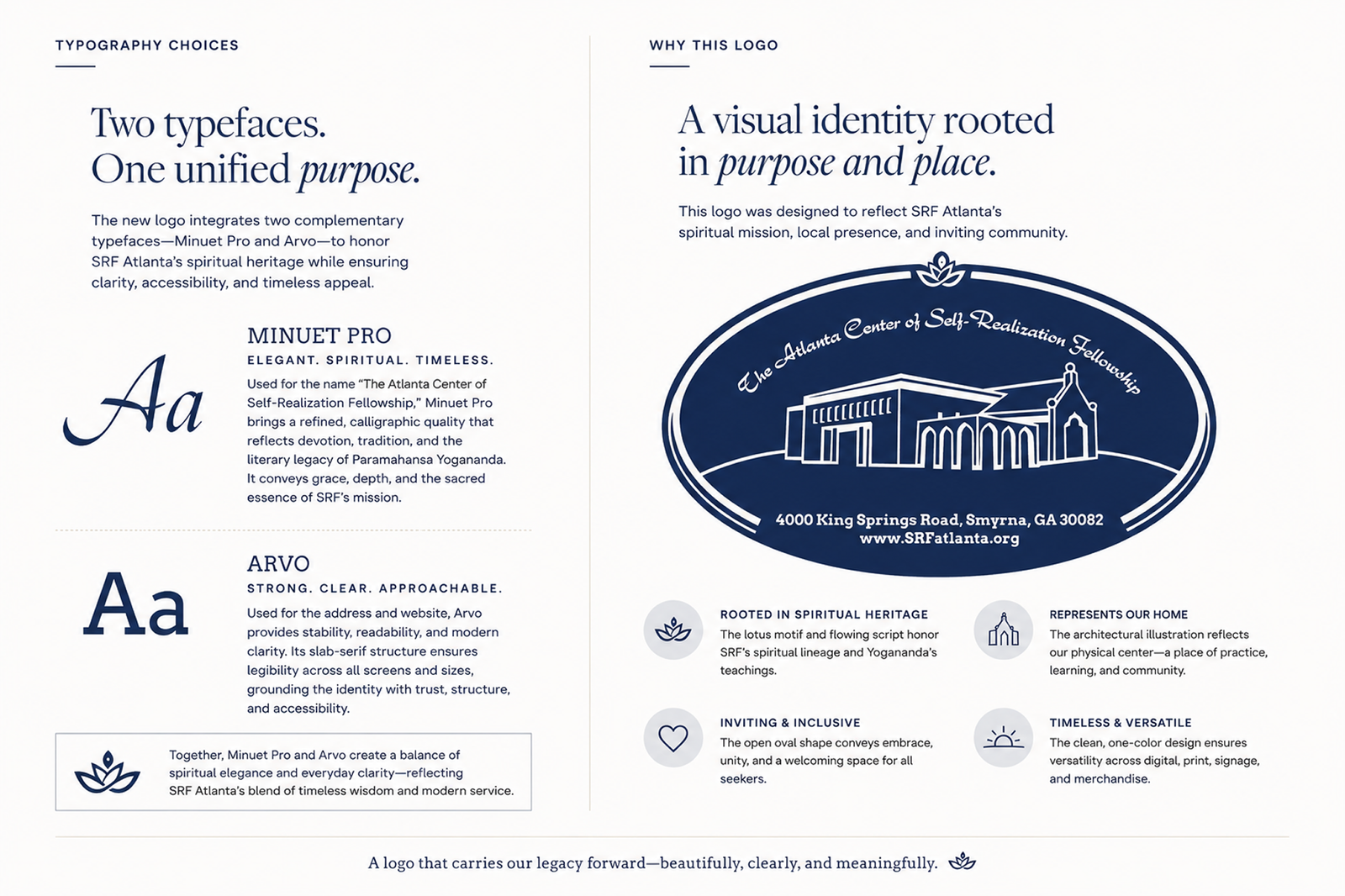
Two Typefaces. One Unified Purpose.
Together, the two typefaces create a visual balance between: Spiritual expression + practical clarity.
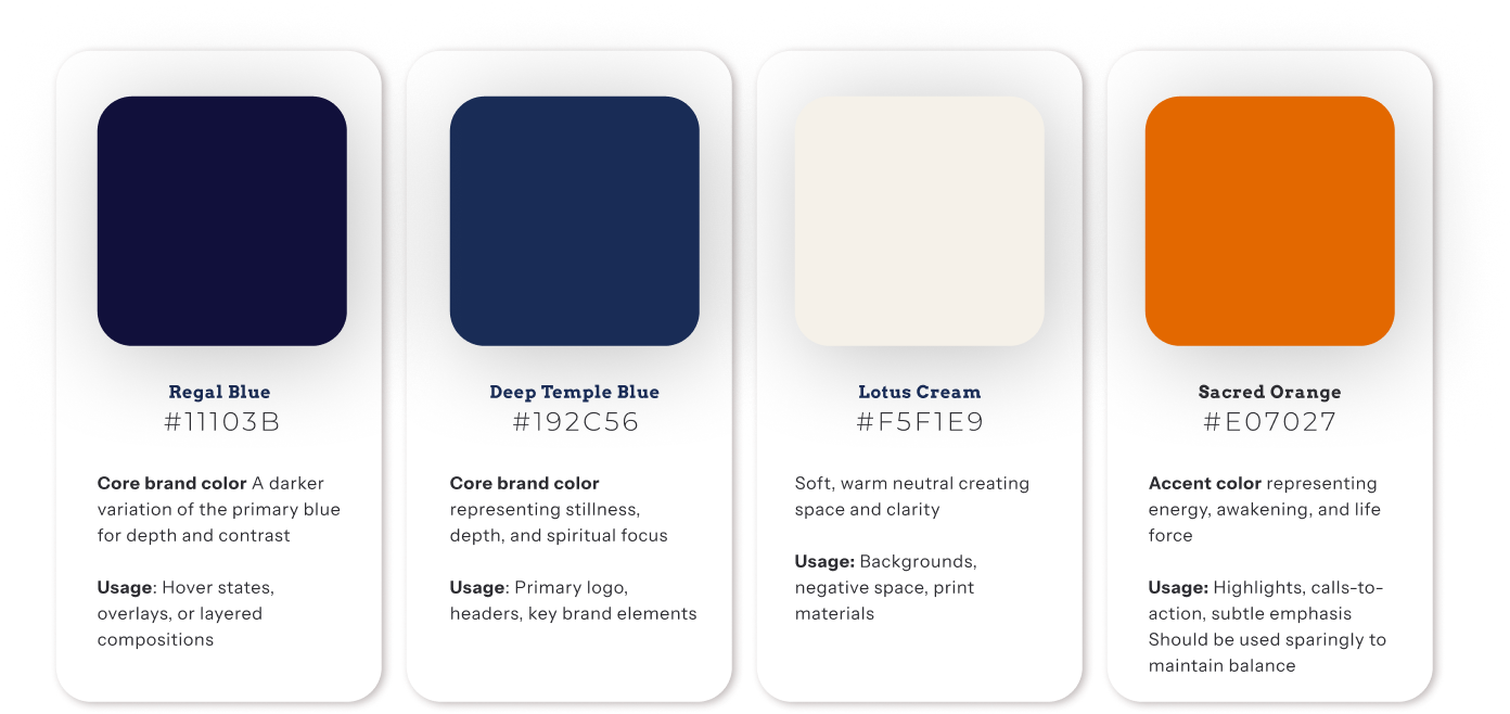
A Visual Identity Rooted in Purpose
The final mark was designed to communicate more than an organization’s name. It establishes a visual relationship between SRF’s spiritual tradition and the Atlanta community it serves. The lotus and flowing typography connect the identity to SRF’s spiritual lineage and tradition. The architectural illustration represents the Atlanta Center as a physical home for meditation, learning, practice, and community.
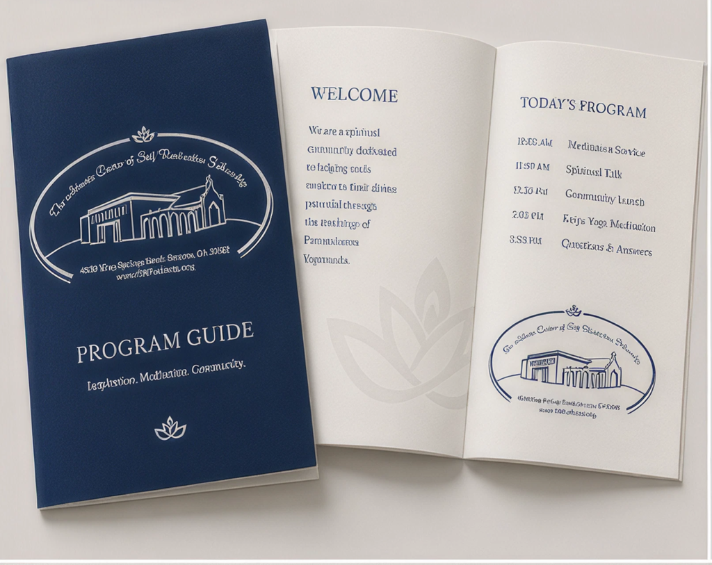
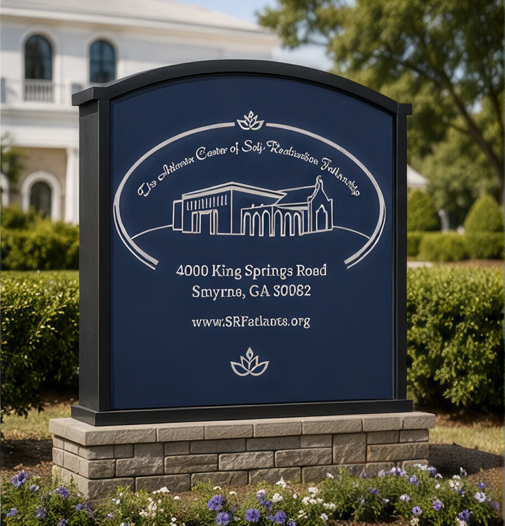
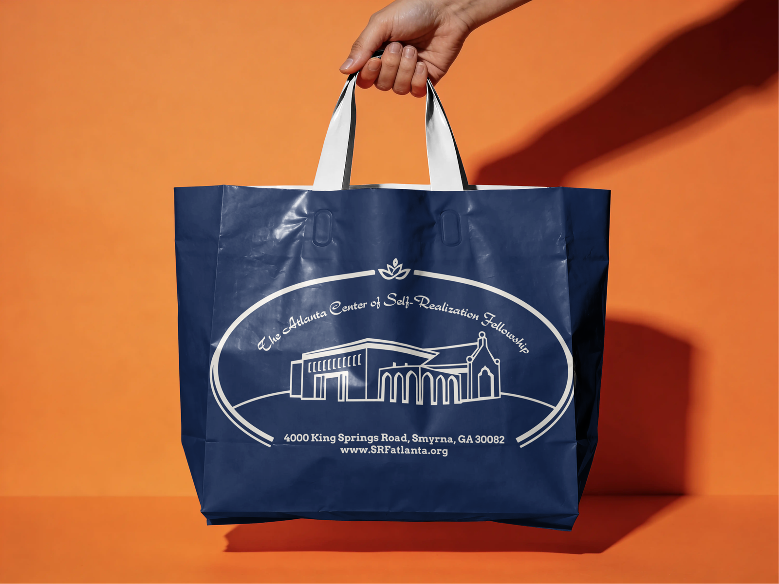
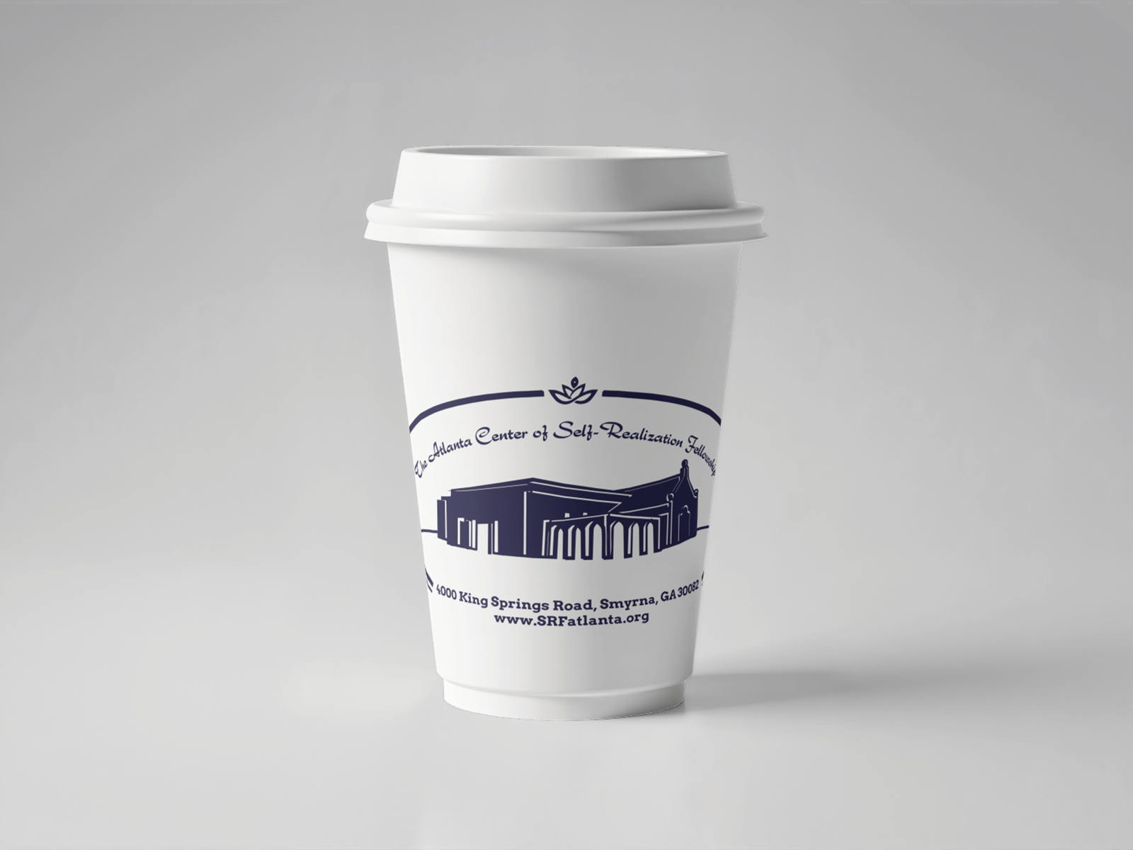
The open oval creates a feeling of embrace, continuity, and belonging. The simplified one-color construction allows the identity to move naturally between digital interfaces, print materials, signage, presentations, and community communications.

Spiritual Heritage
Welcoming & Inclusive
A refined identity with the Atlanta Center's broader communication ecosystem in mind.
The simplified one-color construction allows the identity to move naturally between digital interfaces, print materials, signage, presentations, and community communications.