Making a promotional looking experience feel like a helpful product tool
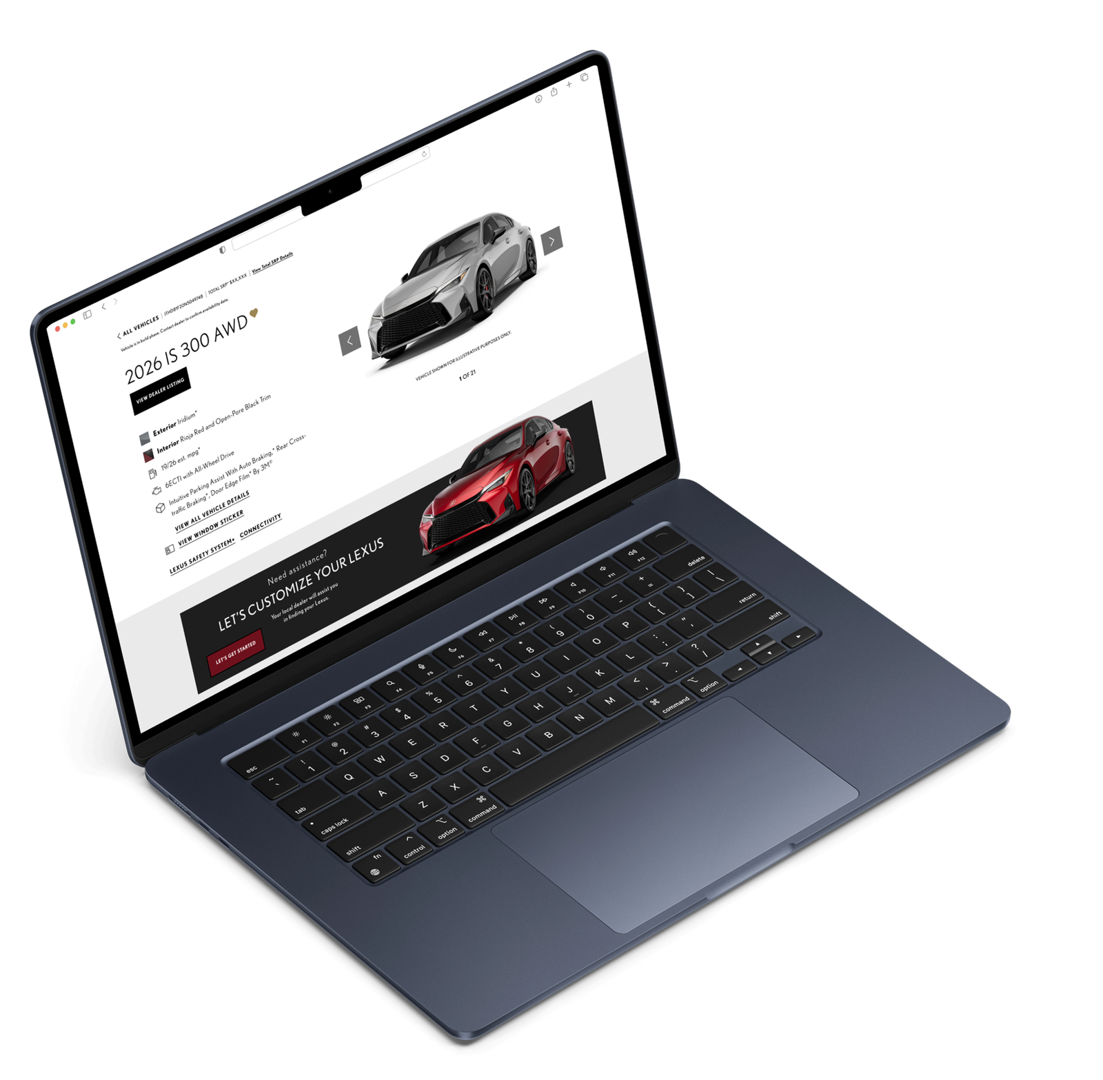
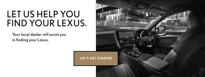
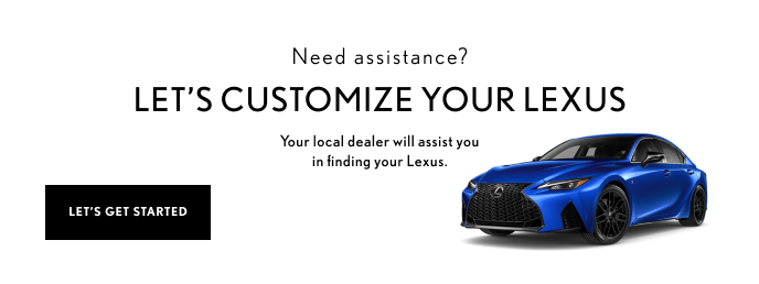
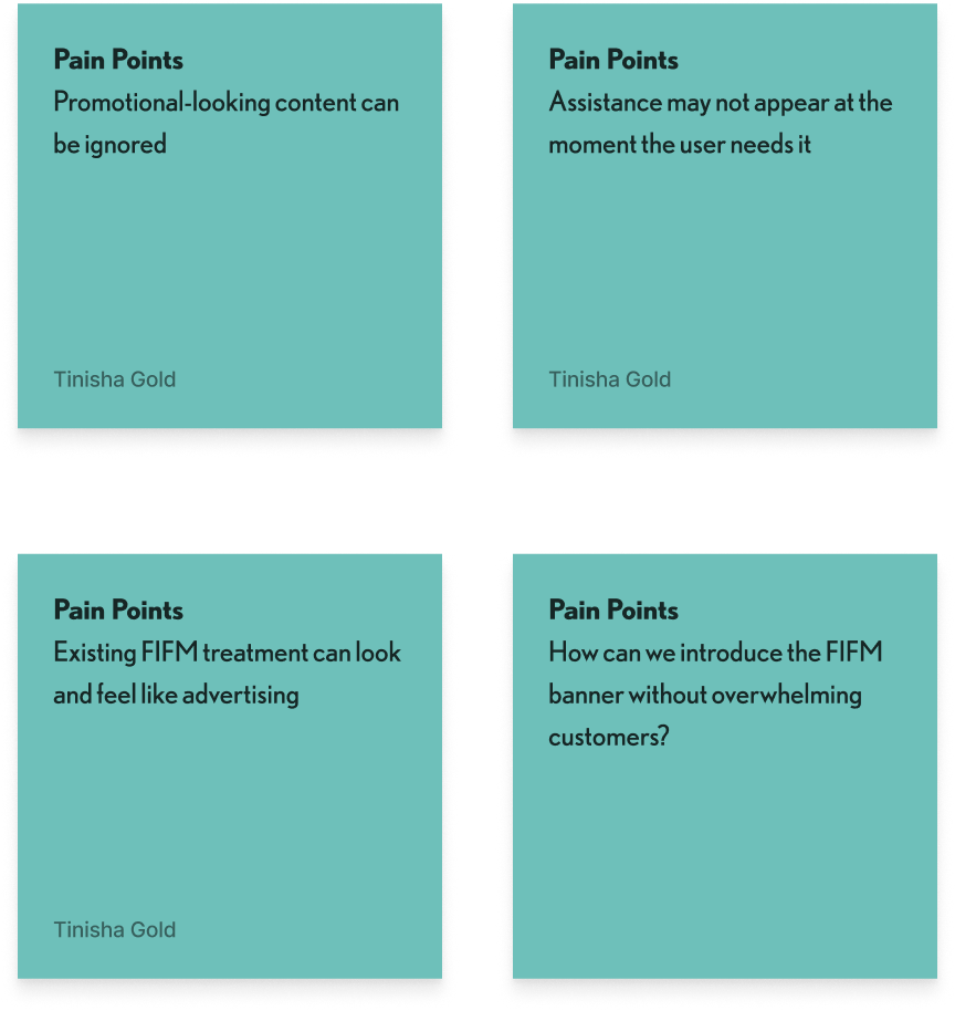
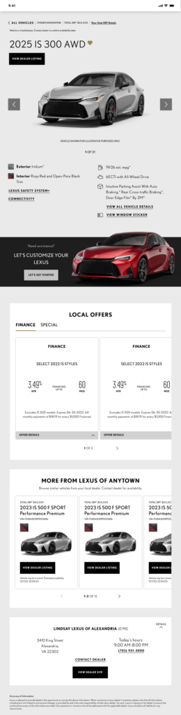
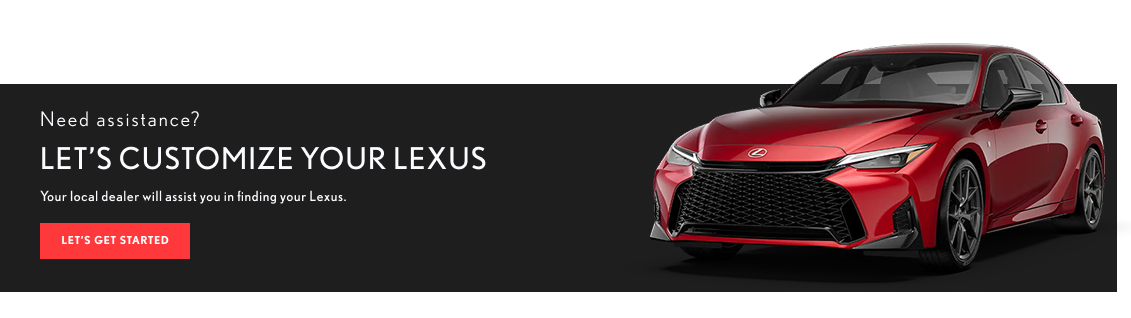
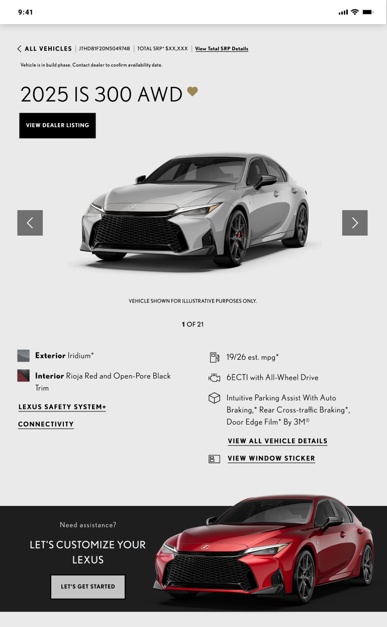
The existing FIFM (Find It For Me) banner visually read more like an advertisement than a helpful tool.
The design opportunity was bigger than changing the banner itself.
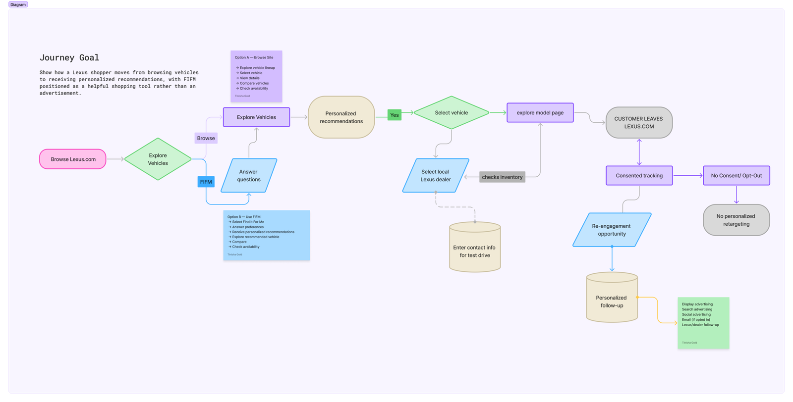
I explored the FIFM experience from both a UI and product-flow perspective, translating the team’s feedback into alternative layouts and interaction directions.
Existing FIFM experience review
UX/UI exploration
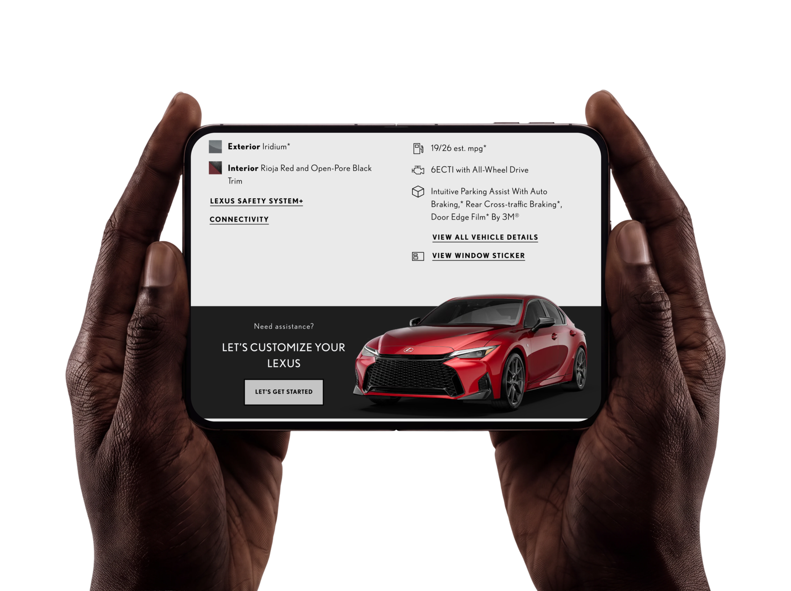
Updated banner comps
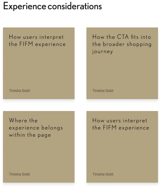
Information hierarchy
CTA placement
Section placement
Alternative page layouts
Dealer-form pathway
The work required balancing the existing Lexus experience with a simpler, more useful path toward action.
DESIGN EXPLORATIONS
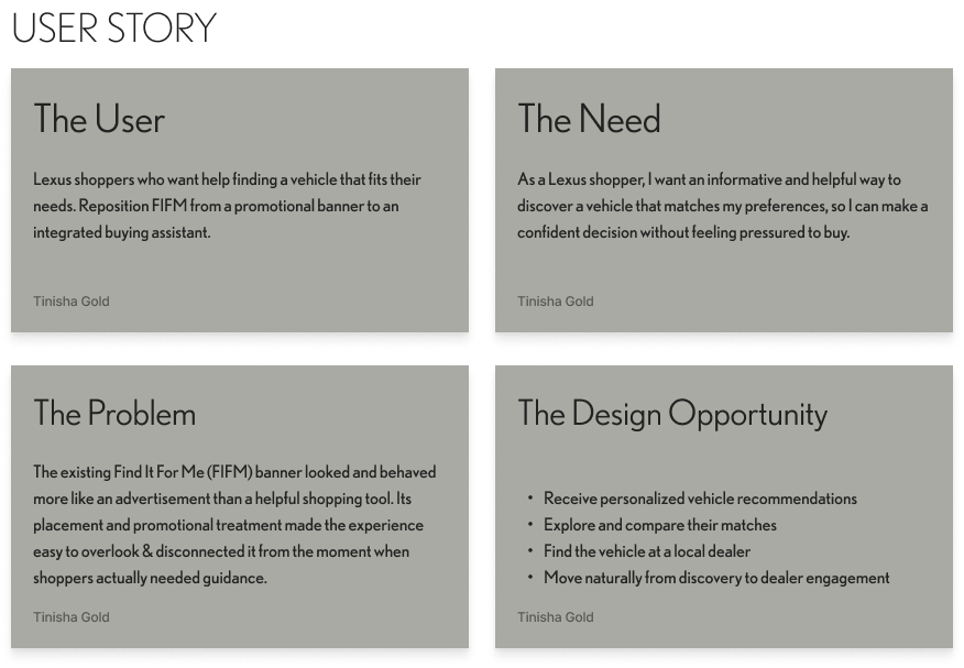
Reposition FIFM from a promotional banner to an integrated buying assistant.
The opportunity was to create a more contextual experience that helps shoppers:
Make the Section More Informative
Instead of treating FIFM as a promotional banner, the first direction explored how the section could better explain its purpose
Remove the Section Entirely & Integrate CTA Elsewhere
The second direction questioned whether FIFM needed to exist as a standalone section at all. Rather than redesigning the card indefinitely, the experience could be simplified by removing the dedicated section and integrating the relevant CTA into an existing part of the shopping journey.
Rework the Layout to Direct Users Toward the Dealer Form Faster
Rather than optimizing FIFM in isolation, the layout was reconsidered around the user’s next meaningful action: reaching the dealer form.
Outcomes and Lessons
What I learned
Good product design doesn't always mean improving the component.
Sometimes the better question is whether the component should:
change, move, integrate or disappear.
Outcome
Created updated FIFM concepts that explored three distinct product directions.
Inform the user
Simplified the experience. Made the experience more useful and understandable.
Accelerate the journey.
Rework the layout to create a clearer path toward the dealer form.
We create ideas worth seeing, stories worth feeling, and experiences worth remembering. Creative direction, experience design, and film—bringing ideas to life from concept to screen.
Quick links
Contact Info
hello@tinishagold.com
Join our Newsletter
Sign up for our newsletter to enjoy free marketing tips, inspirations, and more.