Broadband Nutrition Label

Making the Internet
Make Sense

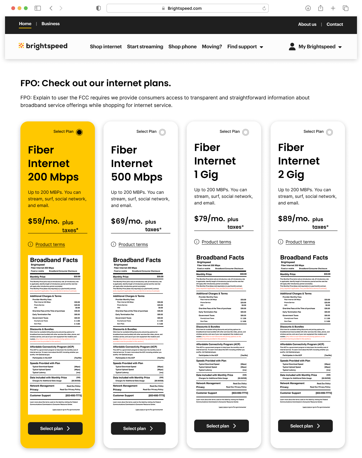
A UX and information architecture case study focused on making broadband plan information easier to understand, compare, and access. Designing a clearer, more accessible way for consumers to explore internet pricing, service details, and plan information.


Project Overview

Role
Sr. UX Designer

Focus
Information Architecture · User Flows · Accessibility

Deliverables
Flows · Wireframes · Components · Prototype 

Understanding Annotations in UX Design

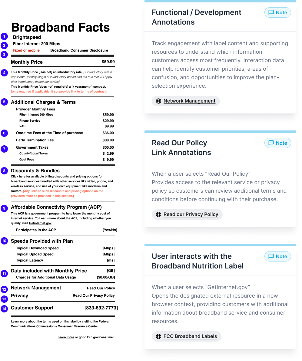
Design Annotations

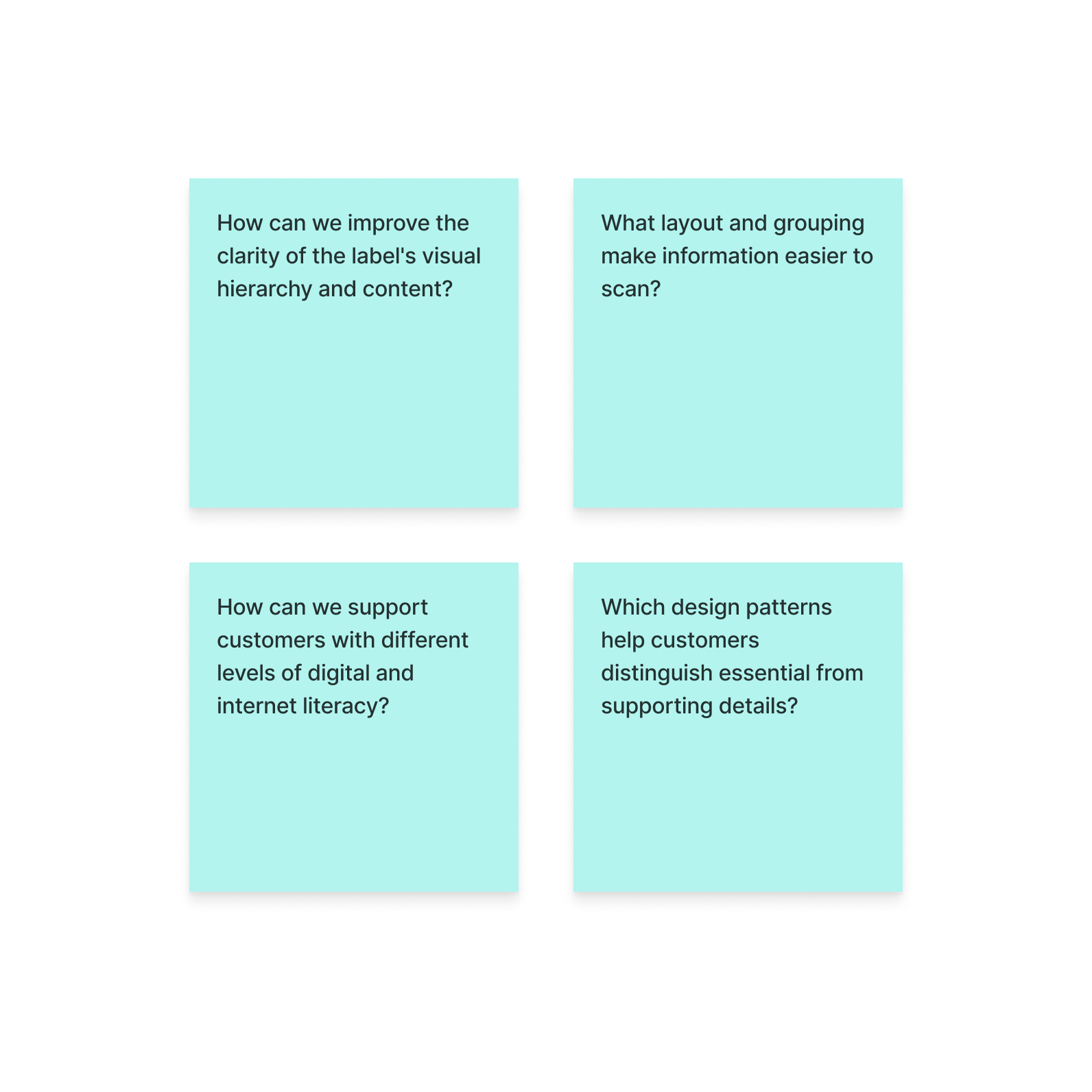
These annotations show the thinking behind the Broadband Nutrition Label, what information customers need, how they interact with it, and what the interface needs to communicate clearly. They connect design decisions to content, accessibility, interaction, and development requirements.

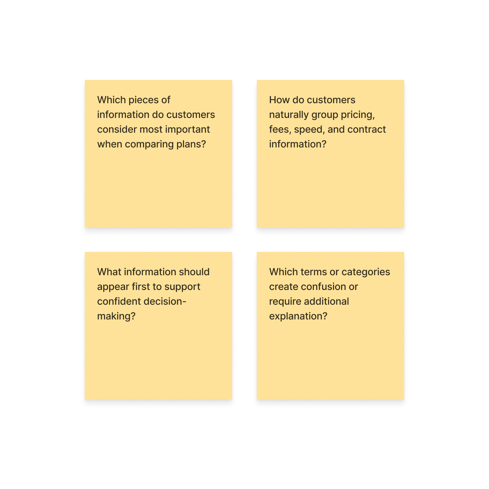
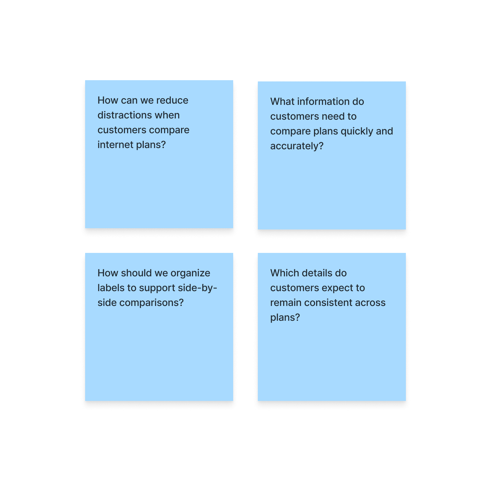
What we're trying to learn

1. How customers naturally group and prioritize plan information?
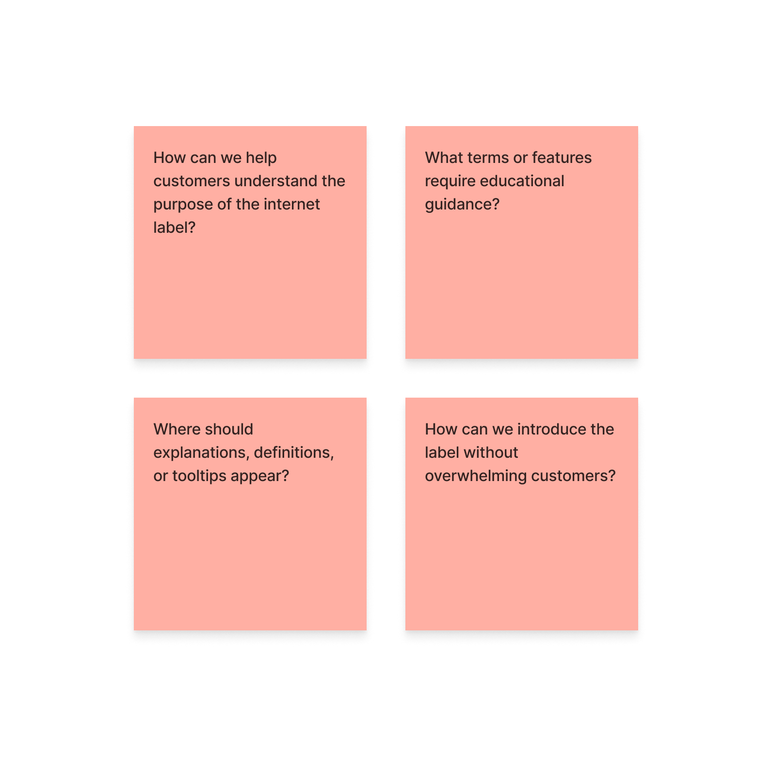
2. Which terms cause confusion or require explanation?
3. Where and how customers expect to find label information?
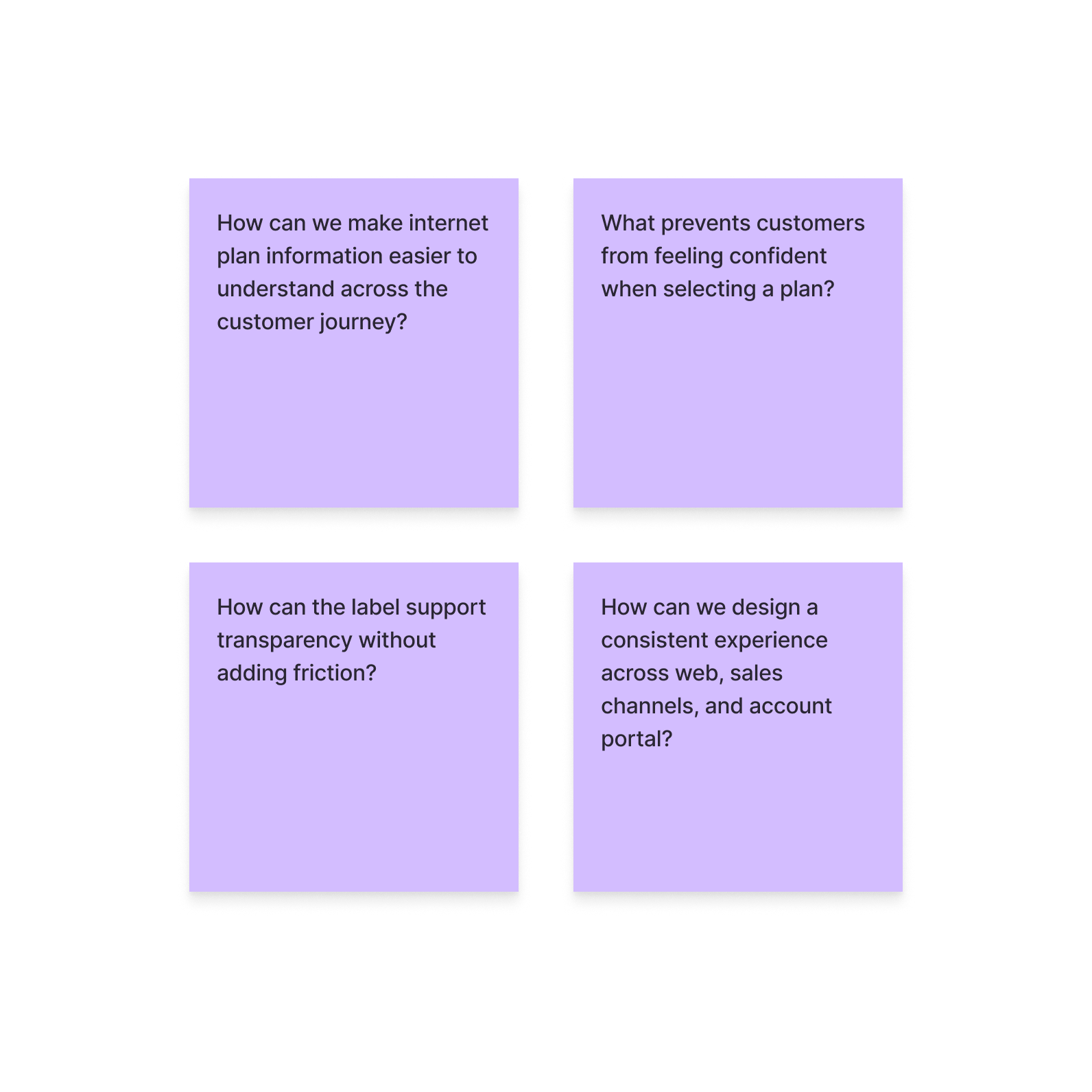
4. What supports confident, informed decision-making?

How findings will shape the label

Insights from this session will directly inform the information architecture, content hierarchy, and accessibility of the Broadband Nutrition Label across the buying journey and account management portal.

Compile and Synthesize Findings

Compile the card sorting findings into a cohesive set of UX insights. Review and refine the results to identify meaningful patterns, clarify areas of confusion, and highlight the findings that can directly influence the Broadband Nutrition Label experience.

Research method

Open card sorting

Findability and Access

Information Hierarchy

Decision-Making

Education and Understanding

Clarity and Accessibility

Overall Experience

Broadband Transparency Through UX Design

From Regulatory Requirements to Human-Centered Experiences

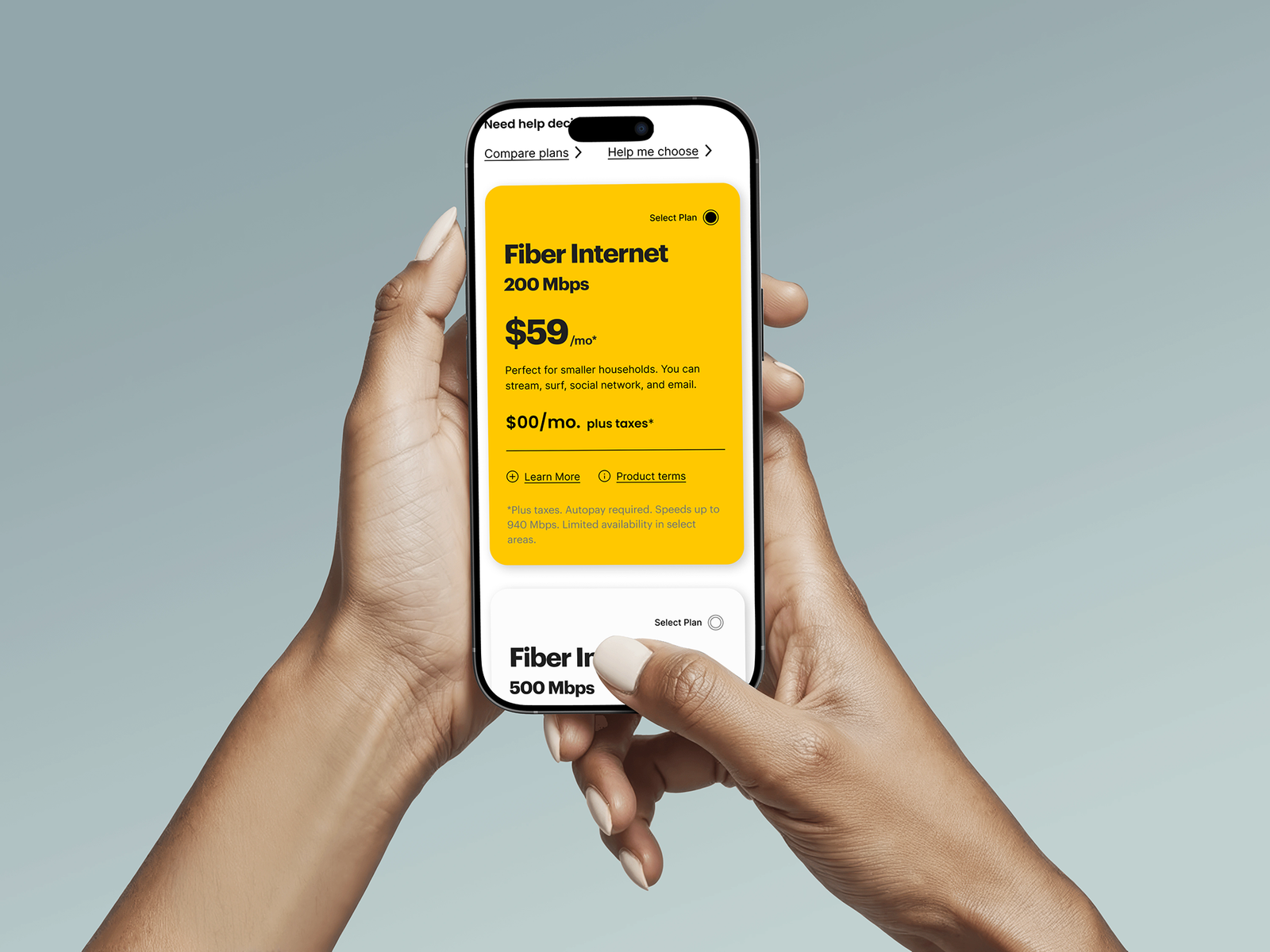
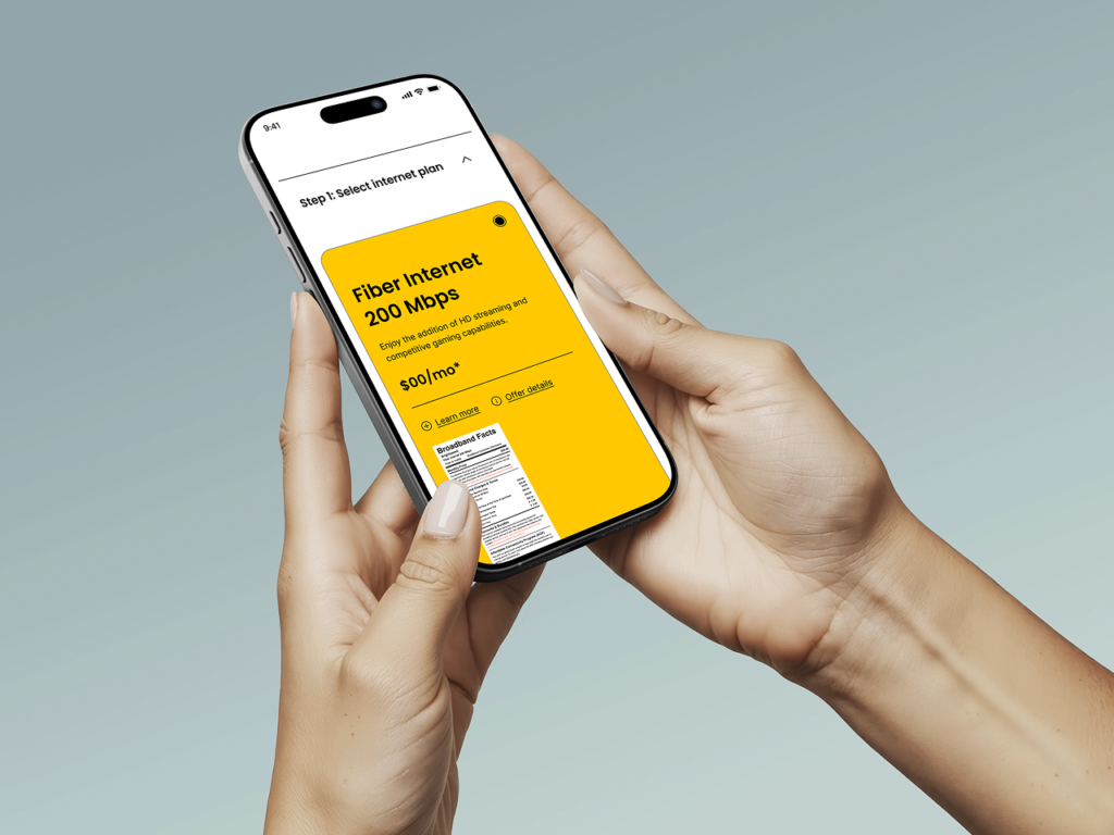
Broadband plan information can be difficult to navigate when pricing, performance, and service terms are distributed across different parts of the purchasing journey.

The Challenge
Designing for Transparency Without Adding Complexity

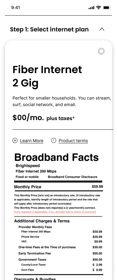
The label needed to communicate a substantial amount of information while preserving a standardized, readable presentation.

UX Strategy
Designing the Experience Around the User's Decision

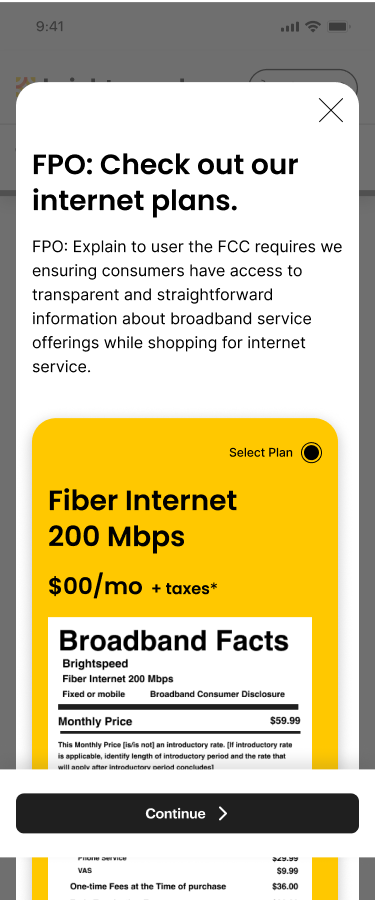
Rather than treating the label as a standalone information sheet, the UX approach considers where and how consumers encounter it.

Design System & Components
Building a Consistent Language for Broadband Information

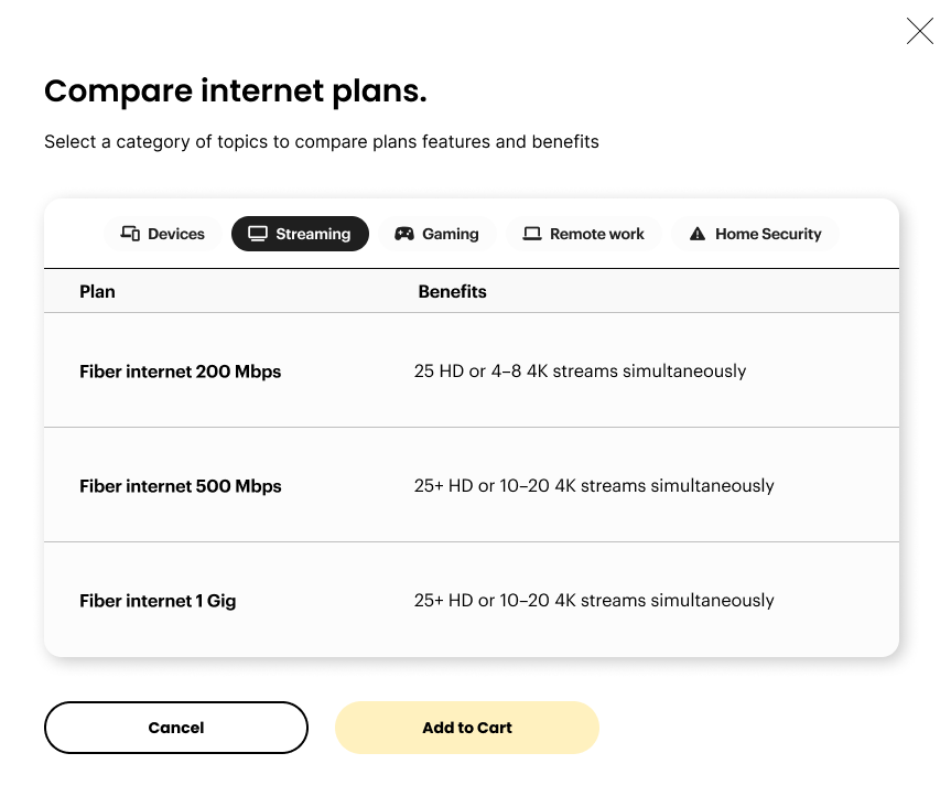
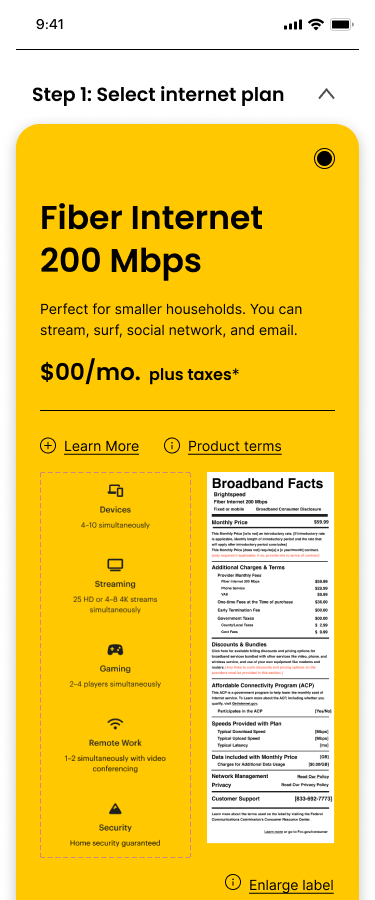
Responsive layouts and repeatable presentation structures for label information.

Reflection
Designing for Understanding

This project demonstrates how UX design can connect regulatory information, user needs, and implementation requirements. My work focused on designing the user flow, creating reusable design components, documenting accessibility considerations, testing the experience, and preparing a clear handoff for development.

Clarity is a design decision. When complex information is structured around real user needs, the experience becomes easier to navigate, understand, and use.