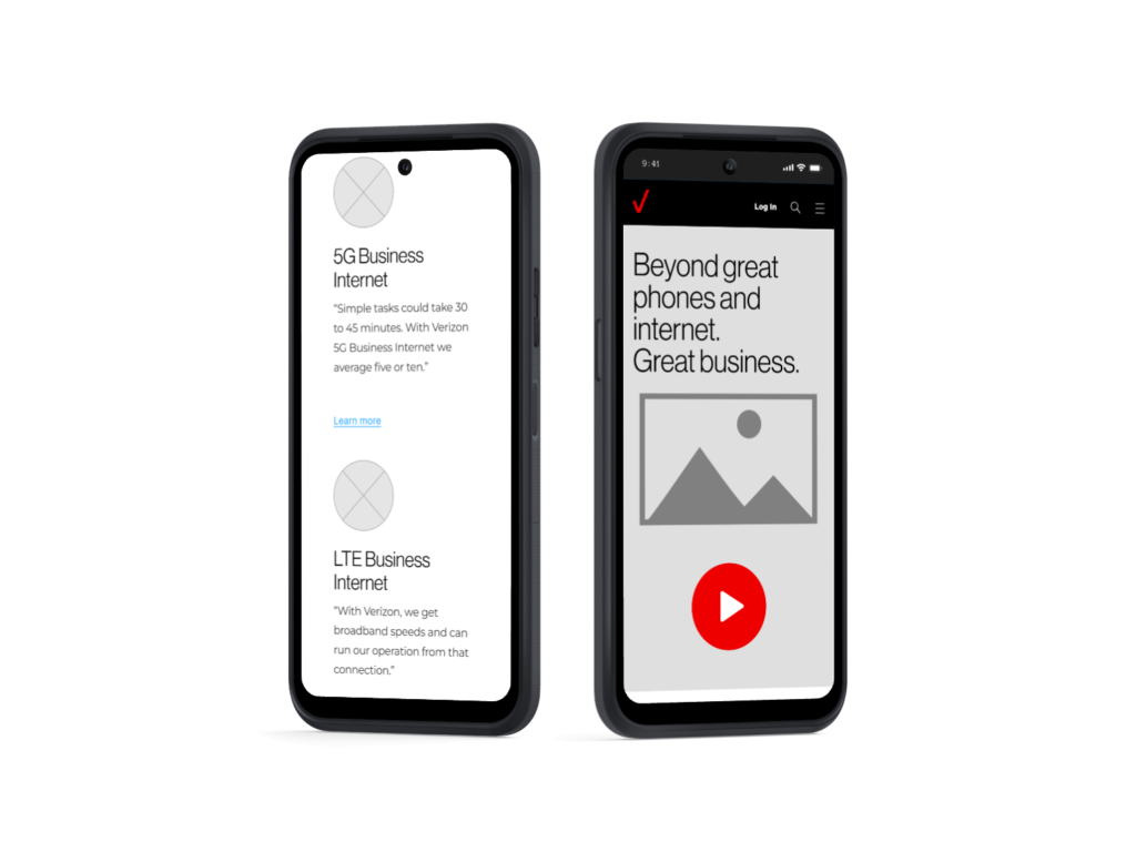
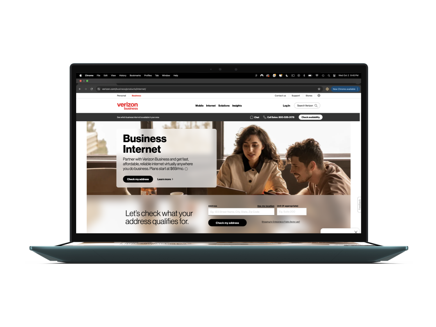
Providing Continuity Between Email Campaigns and the Home Page
Collaborating with the creative team, I was tasked with creating the ‘Why Verizon?’ landing page wireframes to create a more cohesive and engaging user experience.
Clear Visual Storytelling
Streamlined Navigation
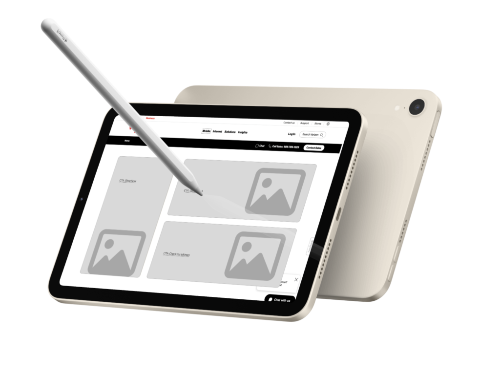
Seamless Transition
Enhance the User Journey
Bridge the segmented email campaign
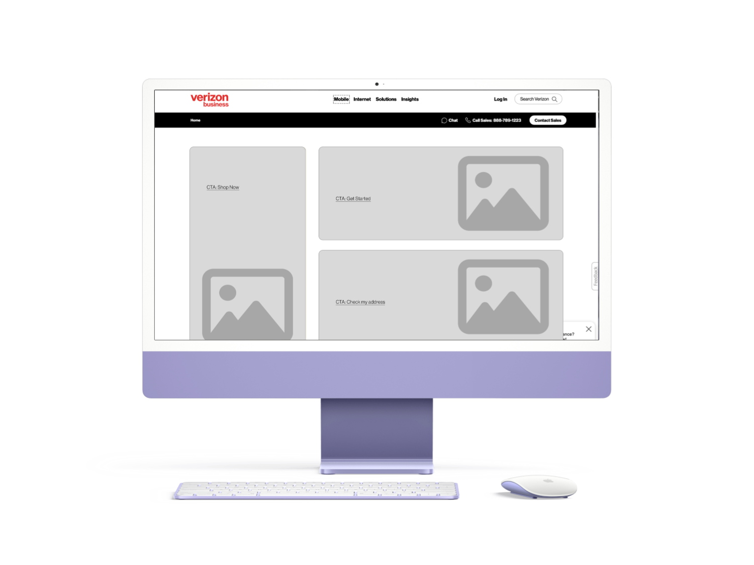
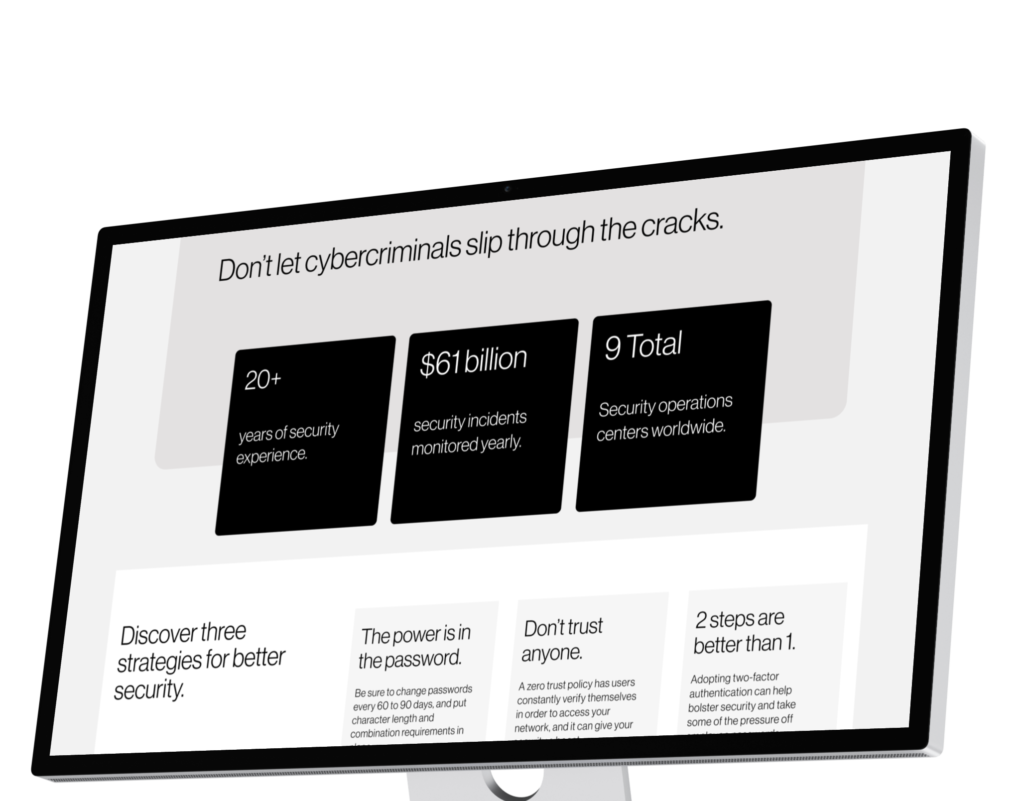
Level up the Landing Page to Convey All Pillars
Strategy and Planning
Based on the research, I developed a UX strategy that focused on clear communication of Verizon’s value propositions, ensuring visual and contextual consistency, and creating a personalized experience. I collaborated closely with the strategy and creative teams to align on goals and plan the execution.
My Role: Sr. UX Designer
Developed New Components for Diverse Use Cases
By creating content hierarchy, we ensured that users could easily navigate and absorb information, making the page both user-friendly and informative.
Utilized headers, sub-headers, and bullet points to break down information into digestible sections.
Developed high-fidelity prototypes
Introducing Compelling Copy to Enhance Messaging
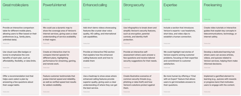
UX Suggestions for All Pillars
Use a consistent layout for each pillar, making navigation predictable and easy for users.
Integrate high-quality visuals, animations, and illustrations for each pillar to create an engaging narrative and make each benefit relatable.
Present each pillar in a card format that can be expanded for more information. This makes the information easy to scan while keeping the landing page clean.
Ensure all content is accessible—use high-contrast text, alt text for images, and easy-to-read fonts to make the pillars usable for all users.